Selected Projects
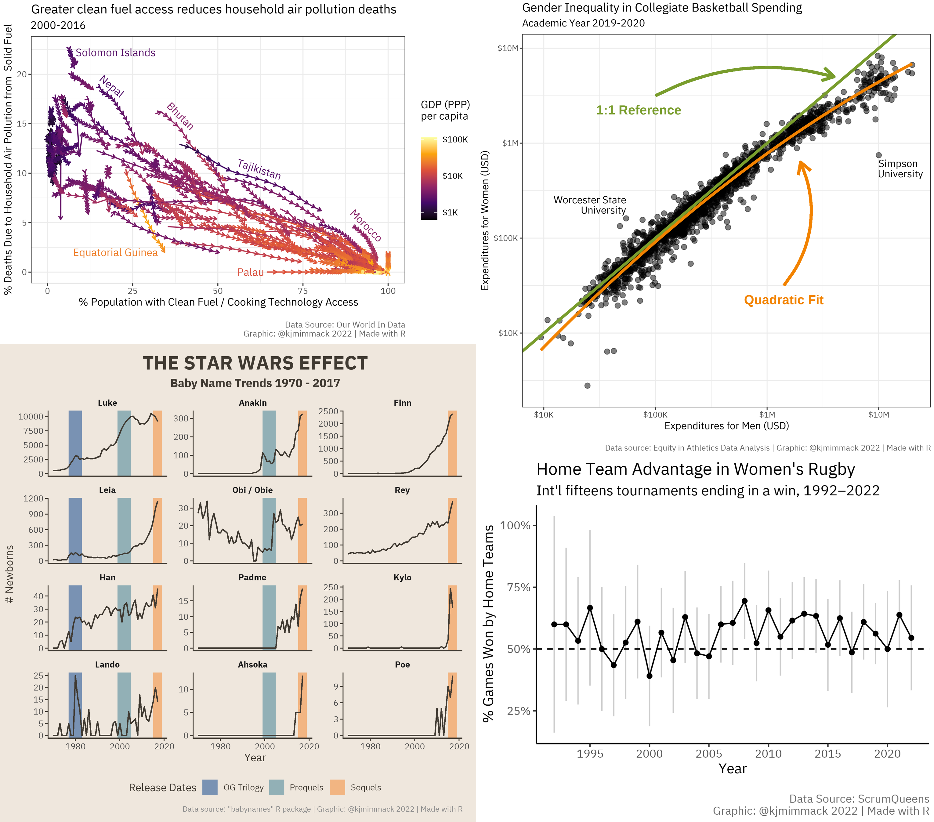
1 “Tidy Tuesday” Data Visualizations
Collection of mini data visualization projects made with R as a part of the weekly Tidy Tuesday challenge from the R4DS Online Learning Community. View on GitHub.
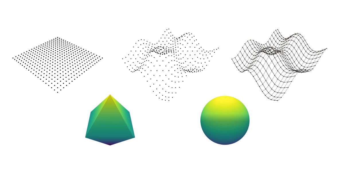
2 Plotting the 3D p-Norm Unit Ball
A walkthrough of the problem-solving process for a tricky 3D plotting question using the Plotly library. This project details how to plot a sphere, a cube, an octahedron, and every continuous shape in between using a single function, with digressions on principles of numerical analysis, coordinate systems, and the inner workings of plotting libraries. Culminates with a live, interactive 3D plot.
View this project in two versions: Python | JavaScript
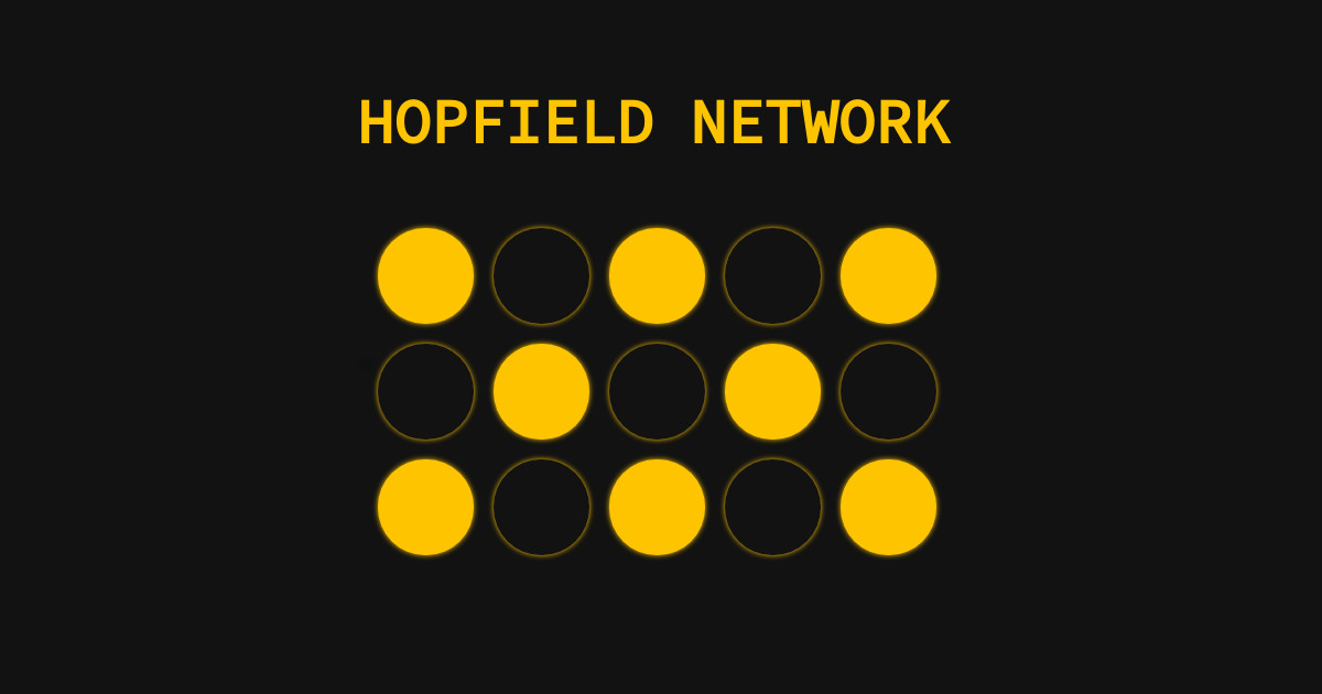
3 Hopfield Network Simulation
A live, interactive simulation of a Hopfield network—a type of neural network that models associative memory. Created with JavaScript.
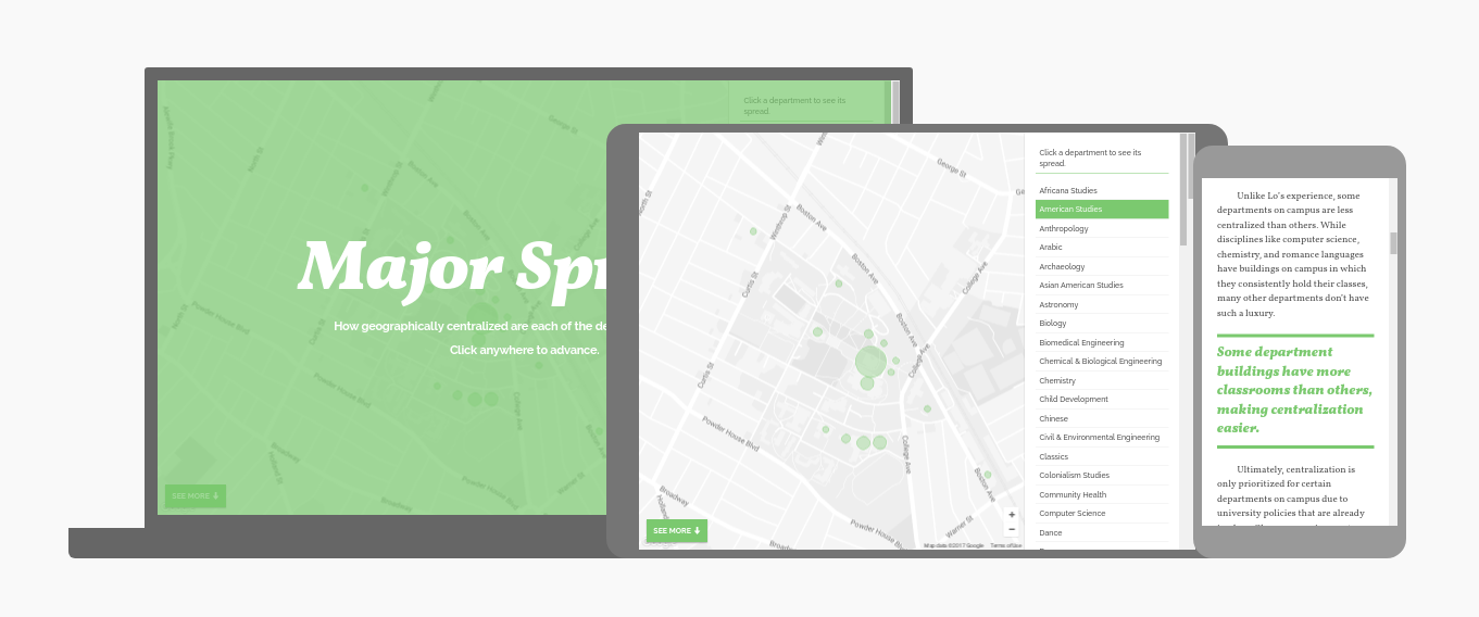
4 Geographic Spread of University Departments
An interactive map of the geographic spread of courses by department at Tufts University. This project was built with JavaScript to accompany an article for the Tufts Observer campus magazine.
Group effort: Kayden Mimmack co-designed, co-developed, performed data collection, integrated data with Google Maps API, and edited responsive mobile design.